

An elevator that lies (and what that has to do with your navigation)
- Topics of this post
- Services of this post
Want to go to the third floor? You press the button and when the doors open, you are there. I have never heard of anyone having to think much about using an elevator. On the contrary, I mostly observe people who, while typing more important things on their phone, press the floor button almost in passing. Intuitively.
A bit of science fiction
Now imagine an almost identical situation. You press the button for the third floor, the elevator rises, and after a while the doors open. You step out—and realize you are standing in a completely different building. At the other end of the city. Perhaps the country. Or the world. You are indeed on the third floor, but at this point that is no longer the least bit important.
You are not just confused. You are probably also a little angry at the elevator and its panel with numbers, which has … deceived you.
Elevators, except perhaps in some science-fiction film or book, of course do not do such things. Their 'user interface' has withstood decades of real-world testing, and we, the users, have completely internalized it.
Just as we have internalized the menu on your website or in your application.
Navigation
The definition of a website usually says: it is a set of pages under the same umbrella domain, with a shared identifier (typically a logo at the top left), a unified visual identity, and navigation. The list of content a user can access is romantically called the 'menu', more technically the navigation.
And it is navigation—just as in a forest or on the open sea—that ensures the user does not get lost.
When we select one of the options in the navigation, we expect something very similar to the elevator: you press the button for the third floor and you arrive at the third floor. That is, to a subpage with the same or at least a related title to the one the link carries. But beware—within the same website.
You can think of a website as a building, and the navigation as the panel with buttons. Because navigation is hierarchically subordinate to the identifier (the logo), the user rightly understands that they are already inside a specific building. Navigation is therefore an internal—not external—wayfinding system.
And where is the problem?
All too often the navigation of a website contains links to completely different websites—and not only on (semi)amateur projects. This highly frustrating error tends to appear even on large, sometimes global services.
We call links that lead elsewhere external links. When they appear in the navigation, they are downright harmful to the user experience.
Why? Because when clicking a link in the main menu (or anywhere they would intuitively expect internal navigation), the user does not expect to end up elsewhere. They expect to stay on the same website. To be accompanied by the same navigation. And to be able to click the logo to always go 'home'.
As with the elevator, they expect consistency here too. Regardless of which floor you enter on, the elevator presents the same panel with the same buttons.
It is no better if you take the user to a 'friendly' website, say a separate site for your other brand. Ironically, it can even be worse: because of a similar visual identity, the user may not immediately notice they are elsewhere. And the confusion is even greater.
A usability slip. And a big one.
What should we do?
There is nothing wrong with external links per se. We do, however, need to follow two basic guidelines:
external links do not belong in the website’s navigation,
we must make it clear and timely—before they click—that they are external.
This gives them a sense of safety. Above all, a clear message: 'With this click you are leaving this website. You will land elsewhere. The navigation will be different. 'Home' will not be the same either.'
Ways to label external links
On a single website we typically use a consistent way of marking external links. There are several options, but none of them belong in the main navigation.
- A An 'external link' or 'internet' icon. Most users recognize them
- B they are especially useful where internal and external links are mixed in the same list. Of course, we choose only one of them.
- C Clear text, e.g., 'More on the Tegaintega website' or 'More at www.tointo.com'. Simple and effective.
- D A link in the form of a logo or banner. Because the logo differs from the current website’s identifier, the user can infer that the link points elsewhere.
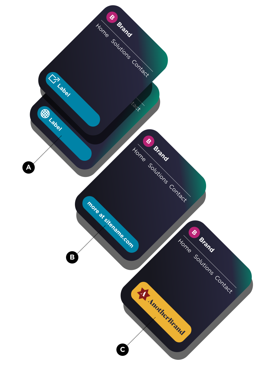
Never in the navigation. Even if it costs you a subpage.
Sometimes external links end up in the navigation simply because there is no other place for them. There is no subpage where they could be placed.
The solution? A new subpage.
True, this requires a bit more work, as you also need to prepare appropriate content. You probably do not want a page with a single button, but that is precisely the price of a good user experience.
For the user it is significantly friendlier to receive the basic information (say about your product) on the website they are currently on. And only then, if they are truly interested, continue via the external link.
As with the elevator, the navigation must first take you to a destination within the same building. Only then can you consciously head elsewhere.
We help with
-
Website planning and design
We develop next-generation web solutions, built on data-driven and goal-oriented online presence strategies. Our holistic approach ensures that your brand not only has an online pr...
-
Innovation and Technology Consulting
Our core competency is identifying the right value for all stakeholders in a dynamic and rapidly changing technological environment. Through an aligned, data-driven, and responsive...
Related Case Studies


Related posts

Domen Česnik
Humanfrog has been included among the Future 100 Slovenia, one hundred Slovenian companies with strong potential for further growth and international expansion. For us, this is an important recognition of our work to date and a confirmation that we are on the right track. At the same time, this ranking gives us additional momentum for the future. It encourages us to continue developing, strengthen our expertise, and create advanced technological solutions that deliver long-term business value to our clients.

Matej Vidmar
Proxmox VE is increasingly used in more demanding production environments, so the question of how to protect such environments effectively is becoming ever more important. Backing up virtual machines is only one element. In practice, reliable replication, fast recovery, the ability to migrate across platforms, and proper access and infrastructure management are equally important.

Domen Česnik
Before going on vacation, we check whether we have documents, access to the bank account, copies of reservations, and insurance. We less often check whether our company also has a "backup plan" for its digital life. Where is its data stored? Who has access to it? Can we move it elsewhere? And would we be able to operate if a key provider suddenly became unavailable?

Domen Česnik
A multilingual website sat on our to-do list for a year and a half, but we never found the right time for it. Client projects, infrastructure, development, and other day-to-day obligations always took priority, so the rollout of the English version of the website kept quietly slipping. The issue was not a lack of content or expertise, but a process that required too much time and coordination. We only found a solution once we connected translation with the existing publishing process.

Aljaž Česnik
At the KCDM event Copyright and Digital Security in the Age of AI at MAO Ljubljana, we opened two topics that companies still too often address separately: the use of artificial intelligence and digital security. The event focused on how AI can help companies with development, innovation, and productivity, without becoming a new source of uncertainty, legal dilemmas, or security risks.
