
Visual identity for the gaming world
- CLIENT
-
- Bitset d.o.o.
- Slovenia
- YEAR OF IMPLEMENTATION
-
- 2021-2022

The challenge
A brand that will live as part of the gaming community
The client, a company known as a supplier of computer equipment in more than 30 countries, decided to develop a dedicated product line for video game players. The story began with selling special chairs for them, but they soon added other products to the range: primarily mice and keyboards. This created an increasing need for a contemporary brand that would - in a fairly saturated market segment - live as part of the gaming community.
Our solution
A strategic approach to brand identity
Through analysis and mapping of other players in the market, we developed a go-to-market strategy for our new brand. Our goal was to get into the mindset and purchasing preferences of the target group - all, of course, with the aim of addressing them as directly as possible and positioning ourselves alongside the established brands that dominate the gaming equipment market. Or perhaps even surpass them.
A visual identity for a visually discerning gaming community
In the next phase, we translated the strategic starting points into several graphic concepts, from which the "gremlincek" emerged (as we call it internally). A mark that is, in fact, a mascot, which became an integral part of the logo, the brand's core element.
The typographic wordmark Byte Zone then came about almost by itself once the "gremlincek" was created. A brand was born that not only lives as a cult part of the gaming environment, it can also be used across various digital and print media.
The road to the iconic Byte Zone "gremlincek"
The creative process that led to the mark - or mascot, if you prefer - was, of course, not a perfectly straight highway. We arrived at the chosen solution through sketching and developing alternative proposals, each of which we then evaluated from a strategic and identity perspective.

The logo comes to life in practice
For the brand to live its own life in the market, we of course had to equip it with documentation - guidelines for the use of the visual identity - and we also designed its basic applications.
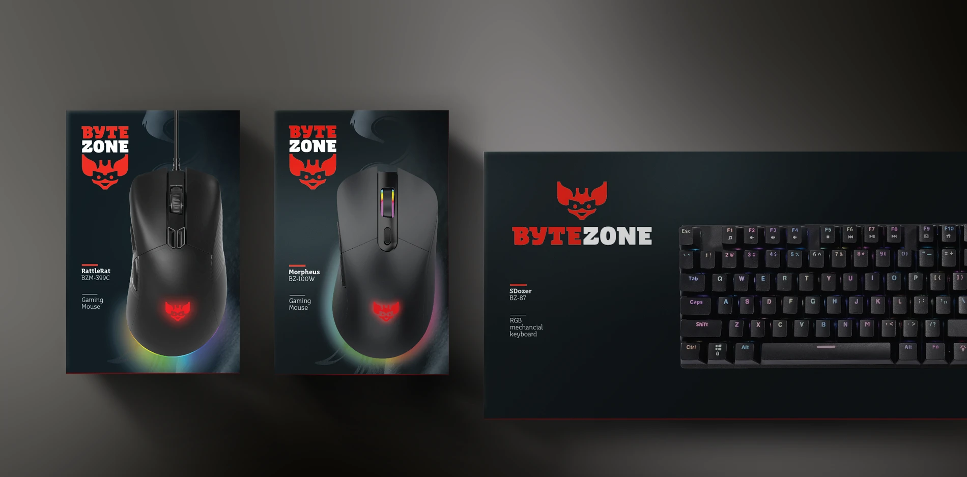
At the heart of the visual identity are certainly the product graphics, as our mascot shines on mice, keyboards, and chairs in online and physical stores across Europe, and of course the packaging for these products.
Visual identity guidelines - the path to consistent brand use
The face of the brand must not change if we want it to remain recognizable, especially in the long term. That is why we developed visual identity guidelines, a document that precisely defines permitted (and also prohibited) uses of the logo, the color scheme, and layout rules.

From packaging to POS displays
In addition to product graphics, print collateral, and packaging, we also designed a system of POS displays for "corners" in physical stores, at trade fairs, or gaming meetups.

Results
Byte Zone has become an extremely popular brand within the gaming community and, in some markets, arguably ranks among the leading players. We are particularly pleased to see gamers looking genuinely proud when our "gremlincek" lights up on their gaming mouse.
Client testimonial
Excellent project and an excellent team! Aljaz and the team convinced us even before the project started with their vision and ideas, and the final product is excellent, as was the collaboration itself.
Leon Balant Marčič
Executive Director
ByteZone / Bitset d.o.o.
Scope of our work
-
Brand development and communication
- Strategic market analysis and brand positioning
- Brand identity development
- Visual identity design
- Packaging design
- Product graphics design
- Print collateral design
- POS materials design


